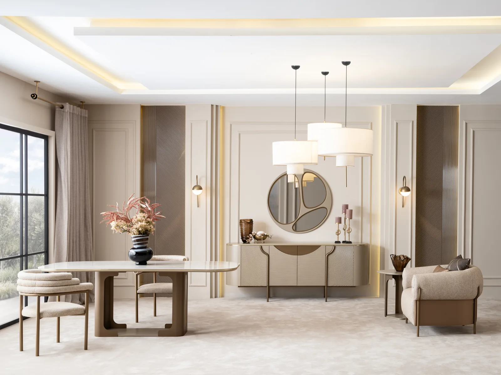
How to Match Furniture Colours: The 60-30-10 Rule and Wood Tones
Short answer: the most practical route to a coherent colour scheme is the 60-30-10 rule — 60% of the space is the main colour (walls, large surfaces), 30% the secondary colour (sofa, rug, curtains) and 10% the accent (cushions, pictures, accessories). Wood tone is considered separately from those three, and using at most two different wood tones in a home gives the safest result. The final say in choosing a colour always belongs to the light in your home: the same grey looks cool and bluish in a north-facing room and warm and beige-ish in a south-facing one.
How is the 60-30-10 rule applied?
The rule says that for the eye to be at ease in a space, colours should be distributed hierarchically rather than equally.
- 60% — the main colour: walls, the large rug, the floor. Usually neutral: off-white, light beige, light grey.
- 30% — the secondary colour: the sofa set, curtains, large cabinet surfaces. A tone that is distinct from the main colour but in harmony with it.
- 10% — the accent: cushions, pictures, vases, floor lamps, a single armchair. Bold colour goes here.
An example room: off-white walls (60%), charcoal sofa set and grey curtains (30%), cinnamon cushions and a coffee table with brass detailing (10%). Changing the accent colour costs very little; changing the main colour means paint and furniture. That is why you should save your courage for the 10%.
How do you match wood tones?

The most common colour mistake is letting a different wood tone into every room. A sound framework is this:
- Use at most two wood tones. One dominant (most of the furniture), one complementary (coffee table, console, frames).
- Match the undertones. Warm undertones like walnut and oak work well together; put warm walnut next to cool grey-oak and both look dirty.
- Use an element in between. Separate two different woods with a rug, textile or a stone/marble-textured surface. Do not let them touch side by side.
- Do not count the floor colour, but do check it. Furniture that is almost — but not quite — the same tone as the flooring is the worst case; either set up a clear contrast or match it exactly.
On how the surface of a material shows colour, our article on the difference between MDF, chipboard and solid timber is also useful: the same tone looks one way on a matt lacquered surface and another on natural wood grain.
Living room colour: the sofa, wall and rug trio

| Wall | Sofa | Accent | Result |
|---|---|---|---|
| Off-white | Charcoal / grey | Mustard, cinnamon | Modern, balanced |
| Light beige | Ecru / cream | Dark wood, black metal | Calm, airy |
| Light grey | Navy | Brass, light wood | Classic, strong |
| Dirty white | Khaki / green | Walnut wood, tan leather | Natural, warm |
| Dark wall (single surface) | Light fabric | White textiles | High contrast, bold |
↔ Scroll the table sideways to see all of it.
In small rooms choosing a sofa close in tone to the wall makes the room feel bigger; in large rooms contrast pulls the room together. For a complete small-room layout see how to furnish a small living room.
Light: the invisible factor that decides colour
- North-facing rooms get cool light. Greys look bluish and whites look hard. Beige, cream and wood with warm undertones balance it.
- South-facing rooms get warm light all day. Cool greys and neutral tones can be used freely here.
- Bulb colour: 2700-3000 K warm white light flatters wood and beige tones; daylight above 4000 K makes fabrics look washed out. Choose warm white in the living room.
- Look at the fabric swatch at home. Showroom lighting and the light in your room are not the same. See the sample both by day and at night, both next to the wall and on the floor.
Matching metals and textures
Colour is not only about paint; metal and texture carry colour too.
- Black metal: works with every tone, modern and neutral. If you are undecided it is the safe choice.
- Gold/brass and bronze: harmonise with warm tones (beige, cinnamon, walnut) and add richness.
- Chrome/silver: sits better with cool tones (grey, navy, white).
- Mixing metals: at most two metal tones in a space; use one of them dominantly.
- Texture balance: a boucle sofa is soft and matt; putting a hard, glossy surface (glass, a stone-textured top) beside it brings the space alive. The Luna sideboard, for example, strikes this balance by combining a dark wood top with a travertine-textured stone block.
How do you tie the rooms together?
Furnishing every room as its own world gives a tiring result. Tie them together with these three links:
- A shared neutral: let the same off-white or beige be the main colour throughout the home.
- A shared wood tone: the living room coffee table, the dining table and the bedside table should be from the same wood family.
- A changing accent: each room's 10% can differ — cinnamon in the living room, misty blue in the bedroom, green in the dining room.
If the dining and living areas share one volume (an open-plan room), the wood tone of the two groups must be from the same family. The quickest method when choosing is to open the product photographs on the dining room and sofa set pages side by side.
5 common colour mistakes
- Choosing a fabric colour from a screen alone — screen calibration shifts the tone.
- Gathering three or more wood tones in the same room.
- Leaving the accent colour in a single spot; it should repeat in at least two or three places.
- Choosing everything in the room in the same tone and flattening the space — a single colour with no difference in texture is dull.
- Leaving the curtains until last; a curtain is a large surface and belongs to the 30%, not to the accessories.
Frequently asked questions
Should the sofa be the same colour as the wall?
It does not have to be. In a small room a tone close to the wall makes the space feel bigger; in a large room contrast defines the seating group. If you are going for exactly the same tone, create a difference in texture.
Does dark furniture make a room look smaller?
If the surface area is large, yes. In small rooms use dark colour on a single piece (an armchair, a coffee table, the TV unit) and keep the large surfaces light.
We covered how glass and mirrored surfaces spread light in the bedroom, and which rooms they help, in glass and mirrored bedroom sets.
How many colours is right?
A neutral main colour + one secondary + one accent — three colours — is enough for most spaces. If you want a fourth, think of it as a wood or metal tone.
Can furniture from different brands work together?
What decides is not the brand but the undertone and the dimensions. If the wood undertone is from the same family and the seat heights are close, pieces from different sources sit together without a problem.
We also explained how to reduce the risk of colours not matching when buying piece by piece in buying furniture piece by piece or as a set.
Trend colour or neutral?
Stay neutral on large pieces you will use for 10 years (sofa, wardrobe, dining set). Enjoy the trend in the easily changed 10% — cushions, pictures, vases.